To frame or not to frame: Episode 2
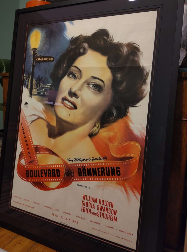
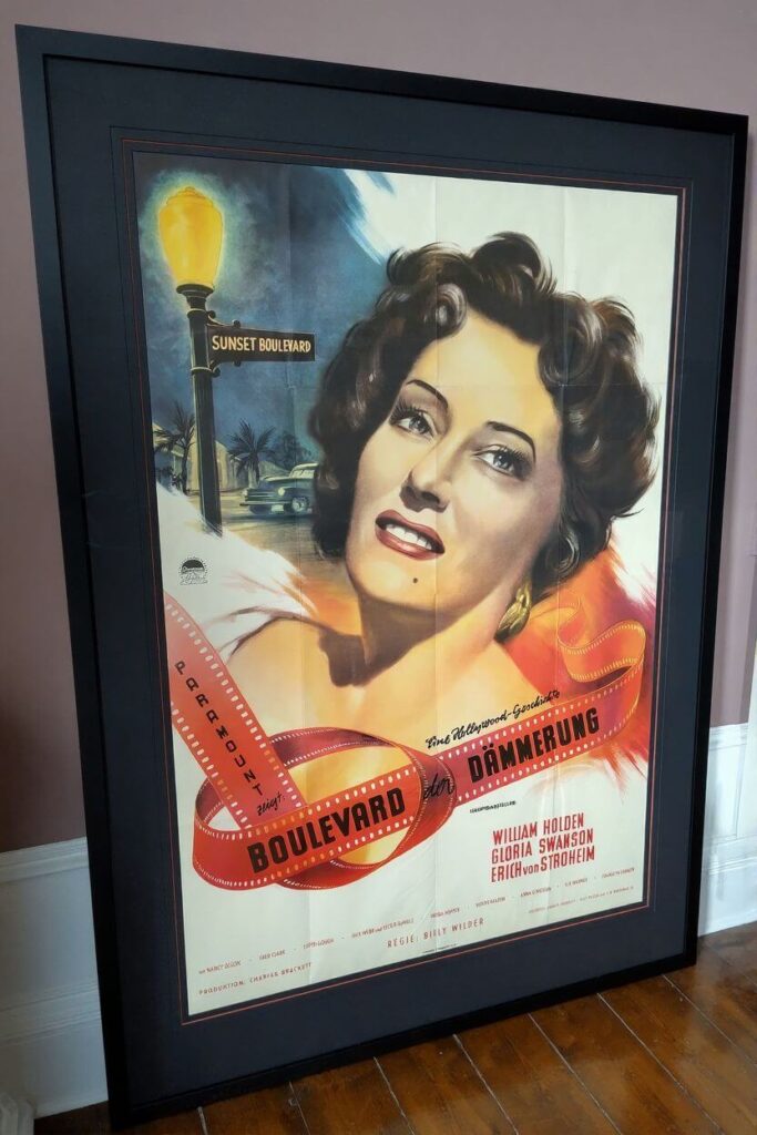
By on March 16, 2026

Here’s another perfectly ‘classic’ approach to framing a vintage movie poster, an original release German 23×33 in A1 poster for ROCKY from 1978:

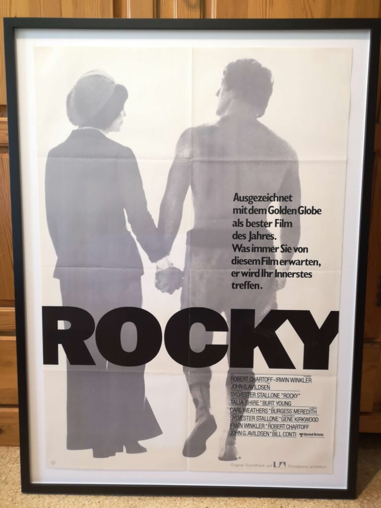
What we see here: A simple yet elegant wood frame with a white spacer and a white backing board. The poster has been fixed to the backing in the corners only, making it ‘float’ in the frame.

What I like about this frame: Movie posters were originally displayed in show cases outside the cinema. This type of frame mimics a cinema display, and in my book it does not get more classic than this.
Also, back in the days, movie posters were sent out folded, and this type of frame also emphasizes on the simply fact that the folds are a characteristic, not a defect. I love it.

Continue Reading

To frame or not to frame, that is the question…

By on March 9, 2026

For the Postercowboy (or any other vintage movie poster dealer), this is a rhetorical question, of course. By design, movie posters are meant to be displayed, and, quite obviously, the best way is to have it properly framed.

Every now and then, clients send me photos of posters they have bought from me in their custom made frames. I absolutely LOVE to see my posters in their new home, so please keep these photos coming!
A few weeks ago, I received two messages, both frames were ‚state of the art‘ in my book, so I asked the senders for their permission to publish them in this blog.

Here‘s the first one: SUNSET BOULEVARD original release German double-panel (1950), app. 33×46 in, folded:

What we see here: An elegant black wood frame, double-matted, with a thin red line in the outer matting and museum style glass.

What I like about this frame: The black border perfectly mirrors the dark mood of this Film Noir masterpiece, while the thin red border line picks up the red color from the film strip. This is clearly a ‚cost no object‘ frame, it perfectly matches the poster and appears to be extremely well made. The final result is absolutely stunning. I love it.

Continue Reading

The Republic Serial you never saw…

By on February 23, 2026

From the Rockin’ H Archives: Sometime in the early 1950s, even a Republic Studios serial based on the Postercowboy character was planned. Apparently, Tom Tyler was supposed to play the lead role.

A movie poster for the entire serial was commissioned, but eventually the project fell through and no posters were ever printed. All that survived is the preliminary design shown below.

This looks like it was loosely based on the US Onesheet for THE ADVENTURES OF CAPTAIN MARVEL, another Republic Serial from 1941, that also starred Tom Tyler. It actually copies the title and cast of the first CAPTAIN MARVEL chapter. If the project had been realized, this part would have been corrected of course.

I find it quite interesting to see that whoever designed this poster actually stayed so close to the comic book covers, including the desert scenery with the rocks and the rising (or maybe setting) sun in the back.

The artist also managed to capture the dark and gloomy atmosphere of the comic books:

Continue Reading

Down Memory Lane: The Art of New Hollywood

By on February 16, 2026

2004 was the year I opened my first brick-and-mortar shop in Hackesche Höfe, a tourist hotspot right in the center of former East-Berlin. The idea arose when I learned that a frame shop was looking for a sub-lease and that the art gallery they hared the place with would move out by the end of 2003.
At the time, I was growing tired from working at home. Also, too many days I found myself in front of a computer, in a bathrobe, with an empty coffee mug, at four in the afternoon. So I figured it was time for a change. I bought the chest of drawers the previous owners had brought in, put a desk, a phone and my computer in, hung some movie posters on the wall, and voilá: Galerie filmposter.net, Berlin‘s (and Germany‘s) first ever vintage movie poster gallery was born!

The opening reception was quite a blast. At the time, an old pal with deep roots in the Berlin club scene worked freelance for Smirnoff Vodka. They called him an ‘ambassador‘, and his job was to deliver free vodka and glasses to club owners by the pallet. Since a vintage poster place was perfectly up his alley, he sponsored the evening. I bought a few cases of cranberry juice, a box of ice and we were set.

Things actually started quite promising, on the second day I sold a japanese movie poster for €500, so I really hung my hopes up high. Unfortunately, I very soon found out that the average Berlin visitor couldn‘t care less about vintage movie posters. Some days, I had over a hundred visitors at the shop and at closing time I had made €20 from the junk box. Even back in 2004, the rent was pretty brutal, so when I found out that my current premises in Kreuzberg were available, I approached the landlord and ‘the rest is history’ as they say.

Most things considered, my year in Berlin-Mitte was quite an ordeal. Way too much time was wasted waiting for buyers, and since there were people at the shop most of the time, I couldn‘t really concentrate on my computer work either.

That said, 2004 was also the year when the Berlin Film Festival focused its retrospective section on New Hollywood. And since I was now a gallery owner, I had the idea to show THE ART OF NEW HOLLYWOOD, an exhibition of original vintage movie posters for some of my favorite films from the 1960s and 70s, including TAXI DRIVER, THE GODFATHER, APOCALYPSE NOW, POINT BLANK, THE LAST PICTURE SHOW, EASY RIDER, TWO-LANE BLACKTOP and numerous others.

The exhibition was very well received, with a good number of visitors and some nice press coverage. What really made this stand out for me was that the Berlin Kinemathek agreed to sponsor the event. There was no money involved of course, but I was mentioned in some of their publications, and by far the best thing for me was that they made me a Guest of Honor for the entire festival. Needless to say, while all Berlinale animals are equal, some animals or more equal than others: While the average visitor had to stand in line out in the cold at eight in the morning for an hour or two for his or her free tickets, I would show up at the ‘more equal animals‘ counter, usually around eleven or so. On the worst days, I had TWO people in front of me, but I always was out on the street again in less than five minutes.
Don‘t get me wrong, I am as much for equality as the next guy, but that WAS fun… Also, they always had 99% of the tickets I wanted, including the top-level premiere screenings at the Berlinale Palast.

I have never before or after seen nearly as many movies in such a short time. I think I saw almost the entire New Hollywood program, plus a few premiere films as well.

As I said, they had tickets for 99% of what I wanted, with only one major letdown: No more tickets for POINT BLANK, still one of my all-time favorite films. In the end, I was lucky again: I knew they would always let a few people in at the last minute, so I just walked up to the cinema to give it a try. Turned out, I knew the guy at the door and (more important) not only did he remember me as well, he also liked my poster exhibition and just waved me in.

The POINT BLANK screening was quite memorable: They had a brand-new, fully restored 35 mm print that was later used for the DVD and looked amazing. Also director John Boorman was there and he had a number of quite hilarious stories to tell about Lee Marvin and the time with him. Apparently, he had a hard time convincing Lee Marvin to do the film, as Marvin outright hated the project. In the end, he said that Lee Marvin agreed to do the movie, but ‘not with this script‘ and he literally threw the script out of the window. Many years later, Mel Gibson came up with PAYBACK, which failed miserably. At the time, John Boorman would tell anyone in Hollywood who would listen that apparently ‘a very young Mel Gibson must have walked by under that window and picked that script up.‘ Boorman said that at some point Mel Gibson actually called him up and asked him to stop telling that story.

I even had a small poster printed for the event, and I was fairly sure I had saved at least a few of them, but if I still have them, I don’t have a clue where they are. I also printed a postcard with the same image, and that I could find. Here it is:

And while I was looking for that poster, I also found an old flyer. I also used this logo for my business cards at the time. More than a tad silly perhaps, but still quite charming I think:

Here’s the backside, without the shop address yet, so I must’ve printed them sometime before 2004:

Continue Reading

Atrocities of the 1980s Part 2: The Dog Boot

By on February 14, 2026

Just when I thought it couldn’t get worse, an avid reader of my blog sent me the image below.

These 1980s dog leather boots were obviously made by the same unknown company who manufactured the hair-on cat boots I posted yesterday. While the cat boots had plush heads for decoration, it appears that the makers actually used the real thing for this pair.

One has to wonder how they advertised these, ‘Step Out in Style – Premium Leather Boots from Your Best Friend!’ perhaps?

Continue Reading

Atrocities of the 1980s: Cat Leather Cowboy Boots

By on February 13, 2026

As discussed before in this blog, John Travolta’s URBAN COWBOY from 1980 started a Western clothing frenzy throughout the entire US and also in other parts of the Western world. For years to come, cowboy boot makers had a heyday, with sales going through the roof.

One of the more questionable aspects of this hype was that pretty much everything that could be skinned would be turned into cowboy boots at the time, including crocodiles, alligators, lizards, pangolins, elephants, frogs, and turkeys. Among the most questionable efforts was the cat leather boot, giving the term ‘Puss in Boots’ an entirely new meaning.

Fortunately, while many exotic leathers are still very popular today, the cat leather trend was rather shortlived. Also, initial rumors that immigrants would steal housecats to turn them into cowboy boots eventually turned out to be entirely pointless.

Here’s one especially uncomforting example:

The pair women’s boots shown here must’ve been any crazy cat ladies dream come true: They were made of hair-on cat skins, with ‘cute’ plush cat heads on the vamps. Looking back, it’s hard to imagine that someone would actually wear these. Then again, if there is one thing that can be said of the 1980s, there were no short-comings on fashion aberrations…

Continue Reading

DENIM The Fabric that build America 1935-44 from Reel Art Press

By on February 10, 2026

While I have always been an avid reader, I have never been much of book collector. I have quite a library of movie poster related books, and they are great for shop deco, but beyond that, when it comes to coffee table books, I do not have much to offer.

Many, or actually most of my favorite movie poster books were edited by Tony Nourmand, founder and former mastermind of the Reel Poster Gallery in London, which rightfully called itself the world’s premiere movie poster place. Starting with his now legendary first publication, FILMPOSTERS OF THE 60s (which was subsequently followed by similar volumes covering the 30s, 40s, 50s, 70s, 80s and 90s) Tony has edited a large number of movie poster related coffee table books.

With his own company Reel Art Press he has long expanded far beyond that, covering all kinds of pop culture topics. If you are looking for a primer on how to do a coffee table book, simply pick up anything that says Tony Nourmand on the cover.

DENIM – THE FABRIC THAT BUILT AMERICA is another cooperation with denim authority and longtime partner in crime, Graham Marsh. It was published in October 2024 and, not unusual, the Postercowboy was somewhat late in the game for this one. I actually stumbled over this book while doing some private research into Japanese denim last year and immediately got me a copy.

To cut a long story short, Tony and Graham have dug themselves through the extensive photo archive of the American Farm Security Administration (FSA). 250 images, all taken between 1935 and 1944, were selected for this wonderful volume.

‘Marty, you’re a lowlife, no offence. You have no style. I don’t ever want to see you again.’ (Cosmo Vitteli)

Cosmo Vitteli is of course Ben Gazzara‘s character in John Cassavetes’ THE KILLING OF A CHINESE BOOKIE. (On a side note, Cassavetes created all the movie posters himself, including my all time favorite Timothy Carey poster which can be seen HERE.)
Cosmo is a night club owner, a gambler, and a somewhat ‚controversial‘ character to put it mildly. But the one thing he has in abundance is STYLE. In Cosmo‘s (half)-world and in his personal set of values, a lack of style is THE WORST possible shortcoming.

If there is one thing pretty much everybody portrayed in this amazing coffee table book has in common, it‘s STYLE. If you are looking for a guide book on how to wear your denims (or blue jeans as we called them in the 1970s) properly, look no further, here it is.

If you have any interest in the history of denim, this volume is also a must-have. You will find plenty to like and a lot to learn within these pages.

And/or if you are anything like me and you simply enjoy revisiting a time when people still had faces you would remember for more than five seconds, this book is also for you.

Reel Art Press is a small independent publisher and their books sell out frequently, so don‘t wait too long or you may be sorry later.

Signed copies of DENIM – THE FABRIC THAT BUILT AMERICA are available directly from the publisher:

Continue Reading

Postercowboy Comics #14: Back from the Dead!

By on February 9, 2026

From the Rockin’ H Archives: Left for dead by his enemies in the last issue, a twist of fate brings THE MYSTERIOUS POSTERCOWBOY back one last time in issue #14, originally published in 1949:

And with this episode we will conclude our brief journey into the world of vintage comics books. It’s about time to get some real work done here…

Continue Reading