How to preserve and store vintage Movie Posters

By on July 27, 2026

Since the topic came up with a client once again today, I figured it‘s about time to write up a few thoughts on the proper preservation and storage of your vintage movie poster collection.

A few years ago, I listened to an art consultant (if that‘s what she was) talking about storing your art collection in an interview on Deutschlandradio. First thing she said was: If you are collector, you have a storage facility. If you do not have a storage space, and everything you own can be displayed on your walls, you are a decorator.

I very much liked this approach, and ever since I have considered myself a decorator, not a collector anymore. These days, I only keep posters (plus the occasional nic nac) I can display, everything else goes up for sale. My store exbition has been ‚basically‘ completed a couple of years ago, but it is quite amazing how I still manage to add yet another small exhibit every and now then. I guess that‘s further proof of my high level of expertise.

Anyway, back to the subject at hand. First of all, let‘s talk about preservation. The necessary effort is pretty much defined by the paper stock the poster was printed on. Fortunately, most vintage US Onesheets as well as West-German posters were printed on very low acidic and very stable paper. Exceptions confirm the rule, but these posters usually do not need any special treatment.

Vintage East-German movie posters were often printed on very cheap, highly acidic paper stock. Somewhat following the example of the country that printed them, you can literally watch these posters fall apart. The only way to stop this is to hand them over to a professional paper restorer for deacifying and linen- or paperbacking. Unfortunately, the associated costs are often in no relation to the value of the poster.

Vintage Mexican posters are even worse: Not only is the paper stock highly acidic, it is also super thin. More than thirty years ago, I owned a noticeable collection of vintage Mexican movie posters and I spent a lot of money to have everything properly preserved and backed on Japanese rice paper. That‘s a very thin 28 grams acid-free paper typically used by museums worldwide. Applying a poster to ‚Japanpapier‘ takes a lot more skill and expertise than linenbacking, and the handful of restorers in the US who are able to do this usually charge brutal prices.
What I personally like about ricepaper backing is that the final result still feels like a poster. Those flimsy Mexican posters feel like ‚normal weight‘ after the backing.

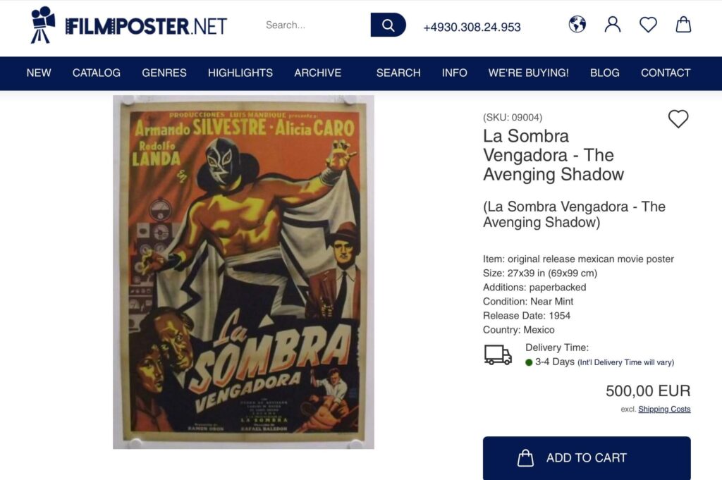
Here‘s one lone survivor from my private collection that was preserved and paperbacked in the late 1990s. Graphically, it‘s one of the Top Ten Lucha Libre movie posters out there:
Fortunately, very few posters require this type of extensive treatment. In most cases, taking proper care of your collection is much, much easier.

The first question is of course: Rolled or folded? If a poster was never folded, the perhaps not so obvious answer is, store it flat. Storing rolled posters in tubes is the most common practice of course. If you do not intend to look at your rolled posters ever again, using tubes is the way to go.
Personally, I do not recommend it as handling rolled-up posters is a perfect nightmare. So unless you‘re willing to accept the fact that you own something and never ever look want to look at them again, storing unfolded posters flat is the way to go.

If a poster has been folded, it is up to you if you want to store it flat or folded, there‘s no right or wrong here.

The main advantage of storing your posters folded is that they will take up a lot less space. Other than that, a poster does not ‚hurt‘ from being stored folded.

One more important fact: Cigarette smoke is poison for vintage paper. It‘s not only the bad smell, cigarette smoke will age the paper and make it brittle. An ozone generator (available for small money from Amazon) can take care of the smell, but of course can‘t undo any other damage.

You don‘t need to build a humidor, but naturally, posters should be stored in a somewhat controlled climate, not too dry and not too moist. Obviously, vintage posters should never be exposed to direct sunlight.

While posters do not hurt from being stored folded, most active collectors like to look at their collections every now and then, and constantly folding and unfolding posters will inevitably harm them over time. For collections that are actively cared for, a flat storage is preferable. Simple acid free cardboard folders can be easily found at any art supply.

If you want to go professional, and the value of your collection justifies the expense, you could have your folders made to your requirements by an archive supplier like Beskid Plus in Poland. At the gallery I use acid-free corrugated boards I had custom made to my required sizes:
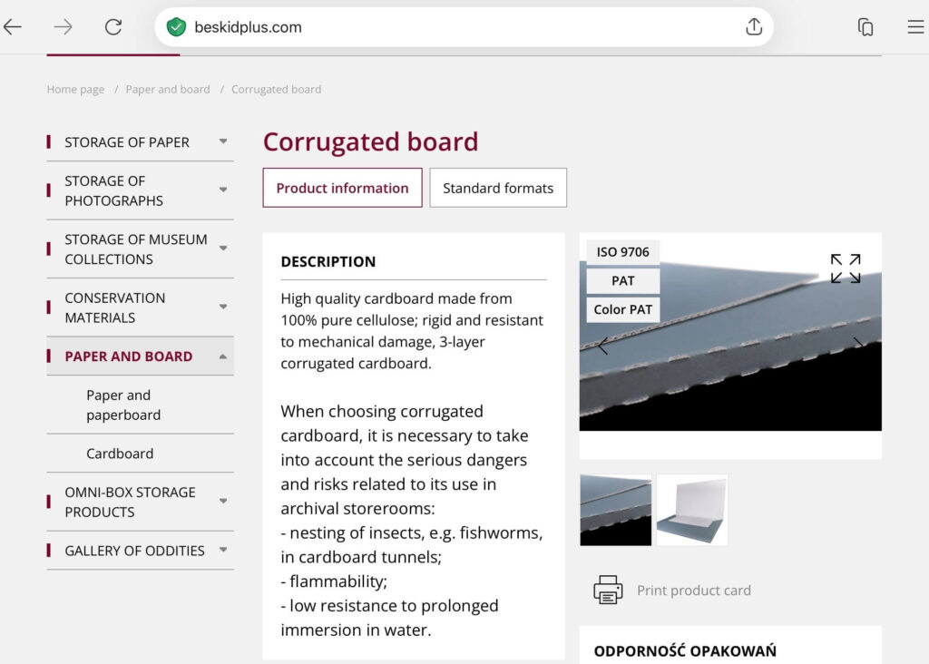
In their description, Beskid mentions that cardboard does not protect against bookworms and other insects. Which is of course true, and a major problem for large archives. In most private collections, this aspect can be perfectly neglected.

One last point regarding flat vs. folded: Once the poster has been folded, the damage has been done. I have a handful of posters that have been stored flat for decades and the fold lines have almost vanished. These are very rare exceptions. It will only work with soft, uncoated paper stock and it takes both a lot of pressure and a LONG time for the fold lines to vanish.
Starting in the late 1960s, movie posters were often printed on more or less glossy paper stock. Once these posters are folded, the top coat breaks, leaving those nasty white marks. Regardless of how long you store a glossy poster flat, this damage cannot be undone.

I frequently see ebay listings that state ‚folded but stored flat, will ship rolled.‘ Unless the poster in question is a truly vintage piece, printed on soft paper stock, there is NO advantage in shipping the darn thing rolled. On the other hand, in my experience at least 90% of the amateur and hobby sellers on ebay have NO CLUE how to pack a rolled poster properly. In the end, you will receive a folded poster with border damages and/or crush marks. Well done, ebay seller!

I have said it before, and I will say it again: Once the poster has been folded, the damage is done. So if you want to ship a folded poster that has been stored flat, fold it again, sandwich it in oversized strong cardboard, wrap it in foil in case some idiot mailman leaves it out in the rain, and place it in a cardboard book mailer. DO NOT ship a folded poster rolled unless you know exactly how to protect it.
Continue Reading

Movie Poster Showcase: FLAMING STAR Lobby Display

By on July 20, 2026

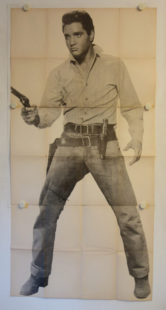
One of the greatest pleasure in the life of this Postcowboy is discovering vintage movie posters he never even knew existed, like this original 1961 release German cinema lobby display for FLAMING STAR I want to show you today:


The poster was printed in three slightly overlapping sections and measures an impressive 88 x 180 cm (app. 34.5 x 71 in). It shows an almost life-size portrait of Elvis Presley as Pacer Burton in FLAMING STAR. The movie opened in Germany on March 17, 1961 and this three-part poster was intended for display in the foyer of large first-run cinemas. Upon its initial release, the movie was not a big commercial success, but today it is widely considered to be Elvis‘ best film.

Unlike the standard A1 poster and the already much rarer large A0 size, this type of large cinema display was seldom used and the format is very, very rare to begin with. This type of multi-part display was printed only for a very limited number of films and exclusively sent to selected premiere cinemas. It was intended for use in the cinema lobby. These large displays hardly ever survived at all. When they had served their purpose, they were almost inevitably destroyed.

Remarkably, this example has apparently never been displayed, which may well explain why it survived at all.
I have never seen this poster before, for all I know so far it has never been offered at auction and it is not documented in any private or public collection. For the time being, I must assume that this might be the only surviving copy. A recent ‚basement find’, it is entirely unrestored and in amazing condition. To my best knowledge, no similar format was produced for this film worldwide.

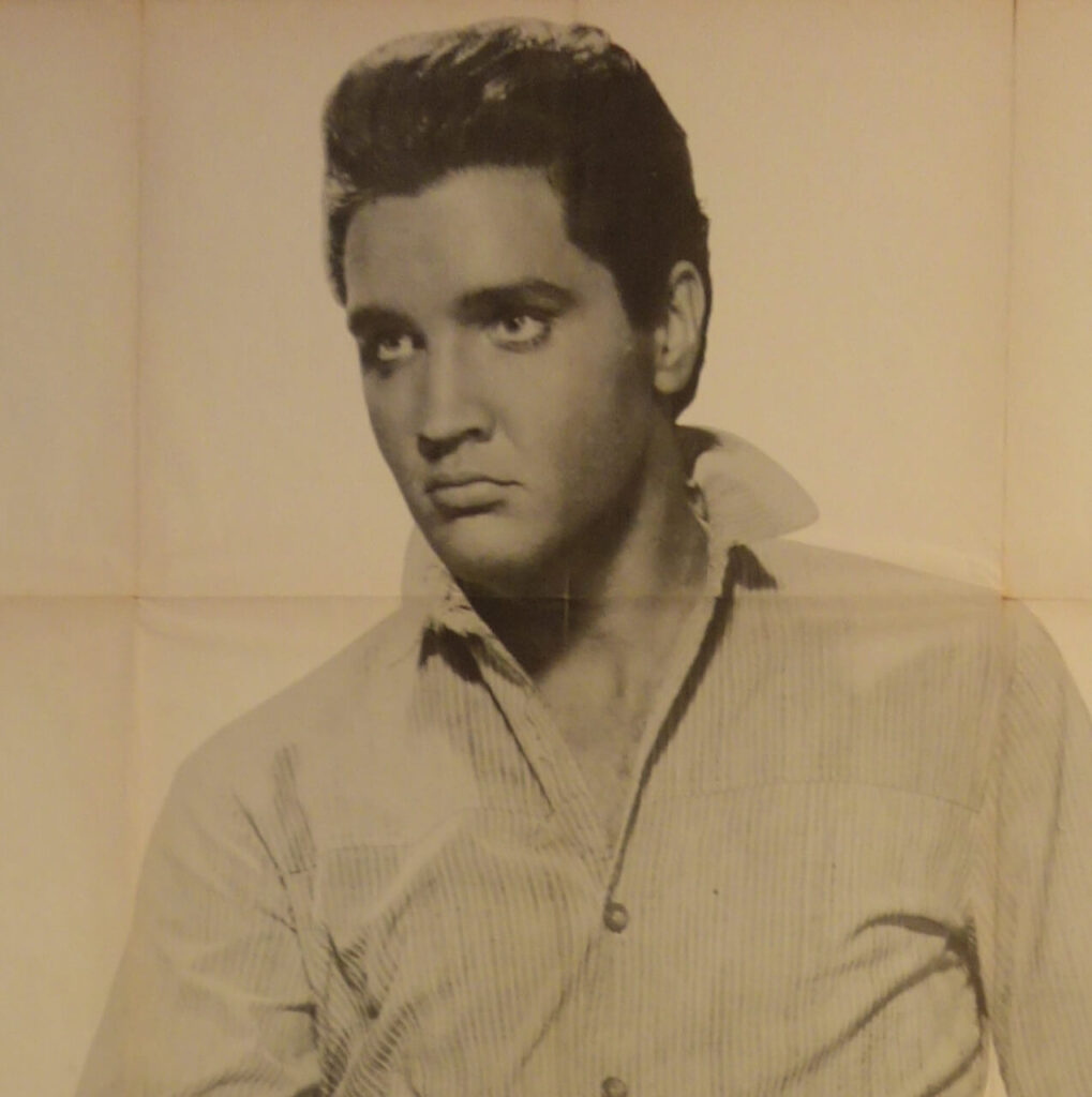
The design is based on a single publicity still blown up to life-size proportions. The poster was very well printed and the effect is nothing short of stunning. Two years later, Andy Warhol used a similar image from the same photo session for his now legendary (and ridiculously expensive) Elvis series.

In an alternate universe, Andy Warhol visited Germany in the early 1960s, and was inspired to his own Elvis series when he saw this display in the cinema lobby. Unfortunately, in this world, Warhol first visited Germany in 1971, so it is rather unlikely that he ever saw this poster.

One more ‘fun fact’: Elvis was about 180 or 181 cm tall. The Elvis image on the poster measures 177 cm. Add the fact that he‘s standing in a wide stance and beckons slightly to the front, that comes very, very close to actual ‘life size’. Whether that was intentional or is just a coincidence is impossible to say today, but they certainly tried to go ‘as big as possible’.

This poster shows Elvis in his athletic prime, and even sixty-five years after it was made, it has an absolutely amazing impact on the viewer. Old Magic. Still works.

Available for purchase. Price upon request.

Continue Reading

Introducing the filmposter.net Waiting Room

By on July 13, 2026

With my big break just around the corner, I figured it’s about time to prepare for the upcoming rush. Here’s the official Galerie filmposter.net waiting room:

So when your next appointment is due, please take a seat. Old newspapers and tab water will be served on request and once Doctor Postercowboy is in the mood to see you, he will call you in!

Continue Reading

To frame or not to frame: Episode 6

By on July 6, 2026

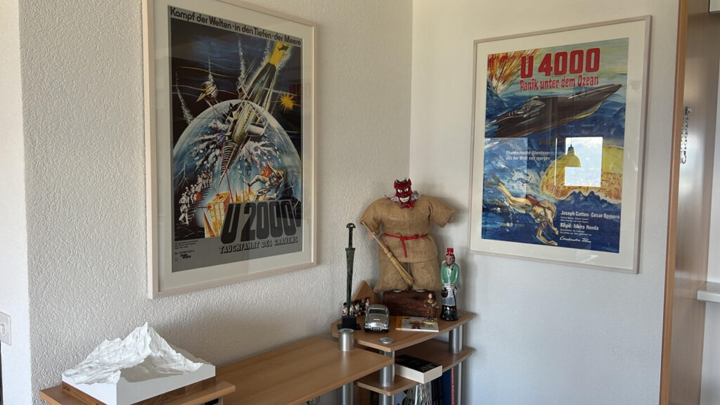
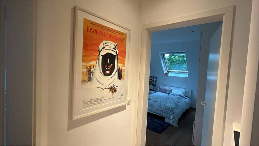
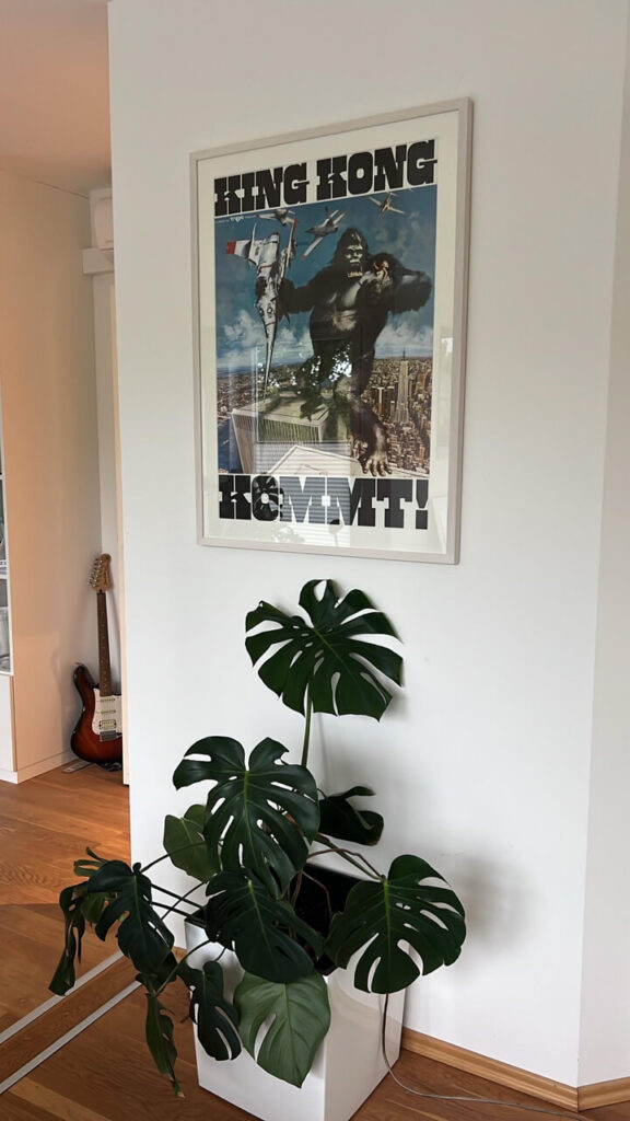
Here’s perfect proof that original movie posters can be both extremely affordable and, if properly framed and displayed, extremely decorative. All of the posters shown here cost less than €100, most of them a lot less. The client decided to keep it simple and opted for identical grey frames with a discreet white matting on all of them, which perfectly allows the posters speak for themselves. Very well done indeed!

Continue Reading

To frame or not to frame: Episode 5

By on June 29, 2026

As you may have guessed by now, the Postercowboy is a man of high standards. I strongly believe that everything worth investing a serious amount of time and/or money is worth to be done RIGHT.

When it comes framing vintage movie posters, 90% of the time a simple, straightforward approach will work best. I have shown a couple of examples earlier in this thread.

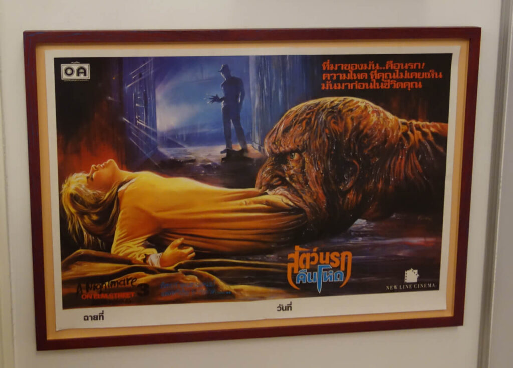
That said, every now and then, something comes up that cries for a ‘special treatment‘. For me, a perfect example is the original release Thai poster for A NIGHTMARE ON ELM STREET 3: DREAM WARRIOR shown below. The movie was the third entry in the Freddie Krueger franchise, and (of course) it does not even come close to original. That said, for me this is definitely the best movie poster for the entire series. According to his website, this is also one of very few NIGHTMARE memorabilia Robert Englund has on display in his home, so I guess he feels the same way.

I had three of these, I sold one, I kept one for my permanent shop exhibition and I as of this writing I still have one for sale. If it is still in stock you will find it HERE.

As stated above, when I decided to have this poster framed I knew I had to do something special and ‘off the beaten path.‘ FRAME WORKS may not be Berlin‘s cheapest custom framer, but when it comes to ‘special projects‘ Claire is always my first choice.

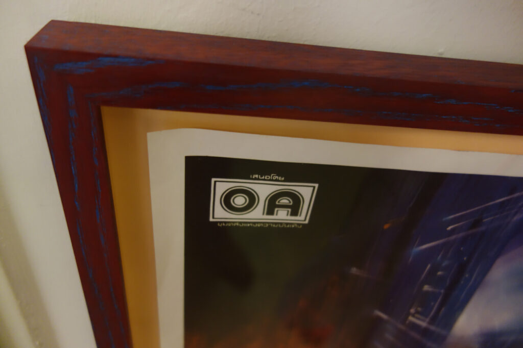
I had a vague idea where I wanted to go with this one, and when I showed her the poster, Claire immediately came up the frame you see below. This is an oak frame that has been painted blue, sanded down and then received a second coat in red before it was sealed with a final waxing. The two-tone color works amazing with the natural oak grain. To take a little credit here, the butternut backing was my idea. I couldn’t really catch the details on the digital image, but in person the final result is absolutely stunning.

I had hundreds of movie posters framed over the last 30 years, and this one is definitely the wildest frame I ever commissioned. It‘s also one of the most beautiful frames I had ever built.

Continue Reading

Movie Poster Censorship on Pinterest

By on June 15, 2026

Over the last 30+ years, Galerie filmposter.net has handled a large number of the nicest and most visually appealing vintage movie posters out there. Which includes numerous seriously expensive pieces, but also tons of posters that are visually striking, regardless of their market value. I‘m showing a number of them in the ARCHIVE section of this website, but I am well aware that I only have a fairly limited reach.

So I figured it about time to set up with Pinterest and create my own pinboard, and here it is:

Unfortunately, my start on Pinterest was not exactly what I had hoped for and actually quite a letdown: Wictor Górka (1922-2004) was a co-founder of the so-called Polish School of Posters. Over the years he created more than 300 posters. His most memorable work is the 1973 Polish movie poster for CABARET. I have laid a ‚reference link‘ on the image, but due to a Pinterest block, it will NOT show this listing, although it is still there. Also, you will need to click on GALERIE FILMPOSTER.NET in the header twice to actually access MY gallery. The first click will once again take you to a random selection of images.

Not only to me, this is one of the most important movie poster designs of all time, and for decades it has held a safe place in my personal 100 BEST MOVIE POSTERS EVER list. (Which is not an actual list at all, but you get the idea.)

You don‘t have to be a movie poster fan to recognise this for what it is, an absolutely iconic graphic design and an outstanding work of ART. Furthermore, it perfectly captures the essence of the movie.

This image was up on Pinterest for roughly 48 hours when they flagged it as ‚Aktivitäten aus Hass‘ which roughly translates to ‚hate-fueled activities‘.

For those of you who have not seen it, CABARET has been labeled ‚the last great American musical’ It is set in the days of the Weimar Republic and while the rise of the Nazis to power plays an important role, this is basically a love story.

Pinterest did not go as far as delete it entirely, but due to the ban the image will not show in their search results. Which is also the reason that the image cannot be accessed through the direct link above. For what it‘s worth, I tried to appeal their decision. Stupid is stupid does, my appeal was turned down and Pinterest stuck with their block.

Honestly, I don‘t even know what to make of this. Is it even stupidity? Ignorance? A general disregard for art? These days, it is hard to surprise me anymore, but in my book, Pinterest has marked a new low here.

By the way, if YOU want to add this original work of Polish Hate Art to your collection, as of this writing the poster is still AVAILABLE.

Be that as may, having an online pinboard to showcase some of the nicest movie posters I have sold in the past as well as a selection of my current inventory remains a nice idea, so (as time allows) I will keep adding images to the Pinterest board.

Continue Reading

THE DARK CARNIVAL Exhibition Spotlight #2

By on June 8, 2026

THE DARK CARNIVAL is the permanent exhibition at Galerie filmposter.net. In a way, it is summary of more than forty years of collecting and probably also an expression of some of my personal trials and tribulations.

In a previous post, I told the story of my WARRIORS subway window card. which is part of the ‚Coney Island Line‘ section of the show.

The ‘Anchor Piece’ of this section is a vintage wooden sign that originally showed the way to the Fun House on Coney Island. The original Fun House closed down in the 1960s, so this sign must be from the 1930s or 40s:

As we can see, the young run is running from the rain. A ‘Shadow of Death’ in form of a US premiere poster for Jean-Luc Godards SYMPATHY FOR THE DEVIL is looming over him, so we already have a feeling that his story might not end too well.

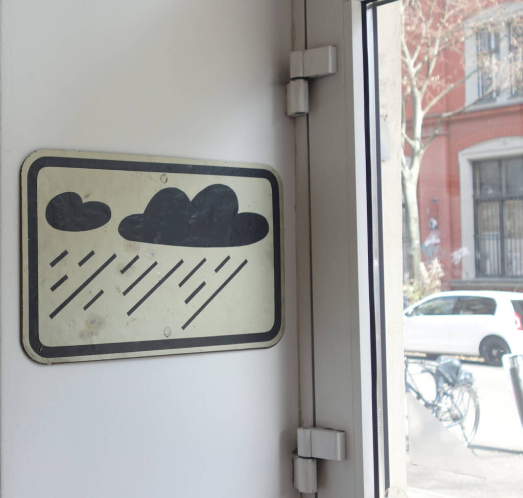
The metal ‚bad weather warning‘ sign was a gift from my ex-wife, and we both have no real clue what this is exactly. She had had it for a long time and eventually gave it to me as a birthday present. Allegedly, this is an actual traffic sign from somewhere in the world, but further details are unknown. It‘s looks great, though and I love it:

Being American, the young man of course came by car. As the license plate illustrates, he apparently came in a 1970 Dodge Challenger originally used in VANISHING POINT:

For those of you who care what happened to Dodge Challengers used in the film later on, click HERE for a sad but rather interesting background story.

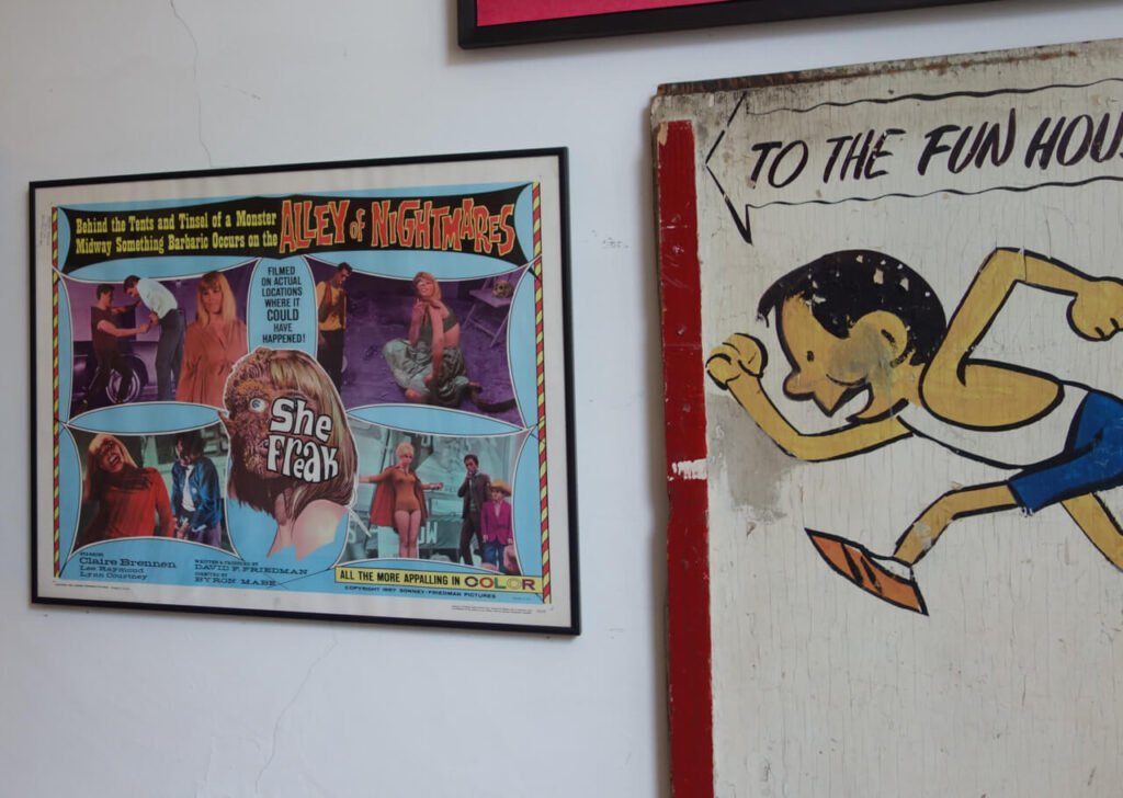
Given the parking situation on Coney Island, I guess our hero might’ve had quite a long way to run. On his way, he has to pass the SHE FREAK and other sideshow booths on the Alley of Nightmares:

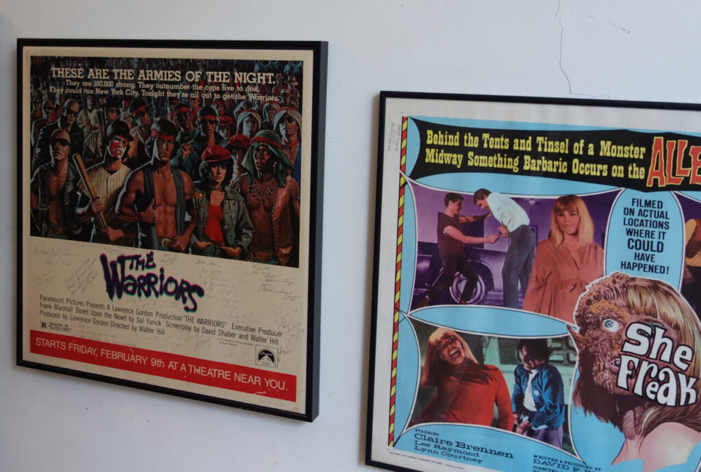
Good for him, the local gang is of the more friendly persuasion:

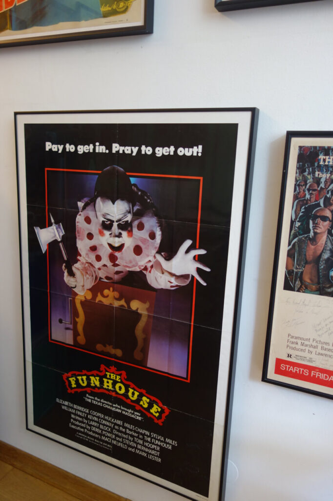
Not so good for him, his final destination is not the kind of place he had imagined:

We have no way to tell what exactly happened to him, but legend has it that the young man has not been seen again ever since.

Continue Reading

The Hunchback of Norderney Revisited

By on June 1, 2026

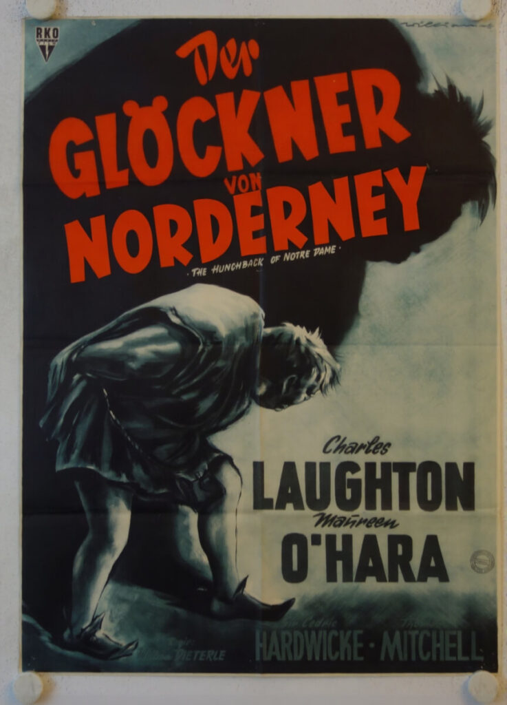
Following up on last week’s post, I was surprised to learn that Charles Laughton’s HUNCHBACK OF NOTRE DAME actually had a limited regional release on Norderney Island in the 1950s:

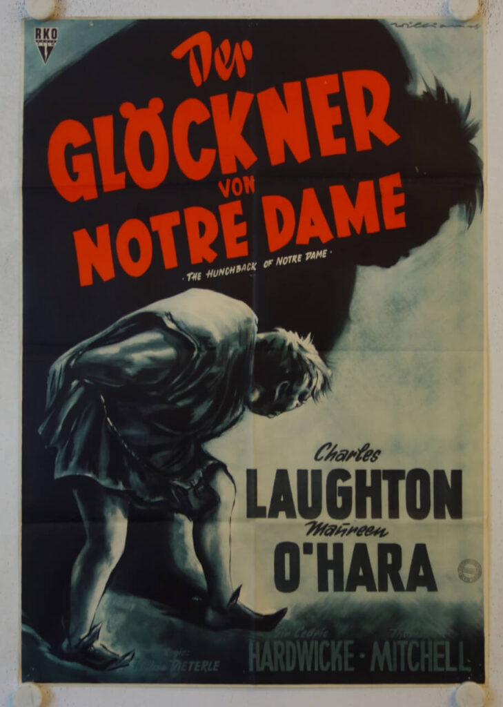
Other than the regional title, the Norderney style poster is perfectly identical with the general release German movie poster from the first re-release, c. 1956 from RKO Pictures.

Both styles show the same artwork by Will Williams:

The Norderney version is most likely one of a kind and not for sale. The other one is actually extremely rare as well and will go up on the website with my next update, probably in July. I am open for inquiries, though.

Continue Reading

The Mysterious Island of Norderney

By on May 25, 2026

Norderney is one of the East-Friesian islands in the Northern Sea and was the destination of the Postercowboy‘s latest field trip. It’s only about 50 minutes by ferry from the German mainland, and at some point, it might’ve been the perfect place for time-out. Unfortunately, about twenty years ago, two brothers decided to use a part of their billion dollar inheritance to ‘modernize’ the island. In consequence, everthing has become ridiculously expensive and Norderney is now another hotspot for mass tourism. The approximately 6,000 locals who live on the island (the investor brothers NOT among them) now have to deal with roughly six million tourists every year. Needless to say, real estate prices have gone through the roof as well, so many people who work on the island can’t afford to live there anymore.
The investors’ latest project is another big hotel, which will close the last available open spot. They claim it will NOT be a 5 Star place for the super rich, but it will have large rooms and suites. Plus a shopping mall and a few (no doubt much smaller) rooms for the live-in servants. Uh-huh.

Mrs. Postercowboy overheard a local lady say something like: ‘When I came here in 2002, it seemed a good idea to live in a place where others spend their vacation. These days, it feels a lot like Alcatraz.’ Frankly, I felt the same thing. Just like Alcatraz, Norderney is so close to the mainland that freedom is always in sight. Yet, for those who are stuck there, it can be impossible to reach.

On Norderney, tourists are technically not allowed to drive around in their car, but they are a allowed to bring it over. With the additional foot and bicycle traffic, that’s A LOT of action. Still, all those real-live horrors aside, Norderney does have its charms and it offers lots of inspiration for the movie and movie poster lover.

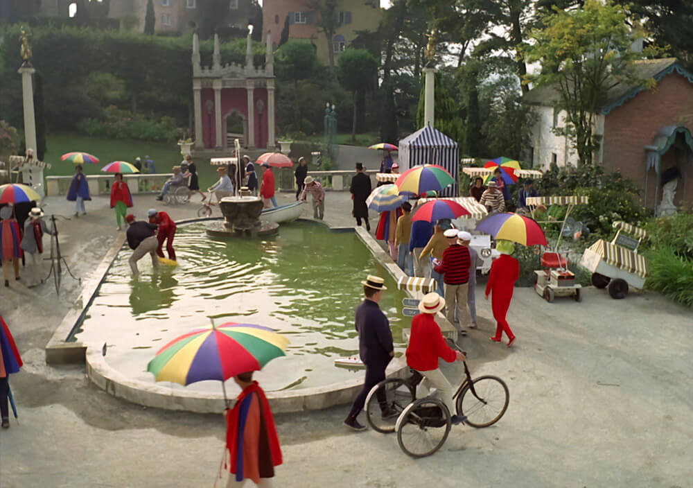
With all those unusually small houses, narrow streets, the busy buy nevertheless oddly quiet atmosphere and all those Germans strolling about for no good reason, it very much reminded me of ‘The Village’ in the 1967 British TV series THE PRISONER:

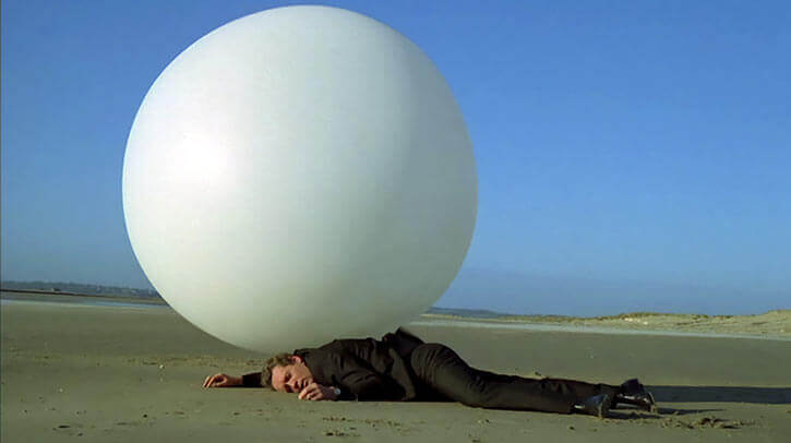
With the Postercowboy in the role of Number 6, desperately trying to get back home:

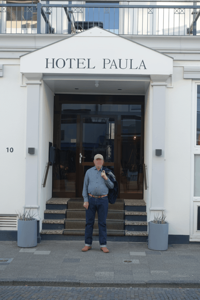
Another letdown was our accommodation. What I had hoped for was something like this:

What I got was this:

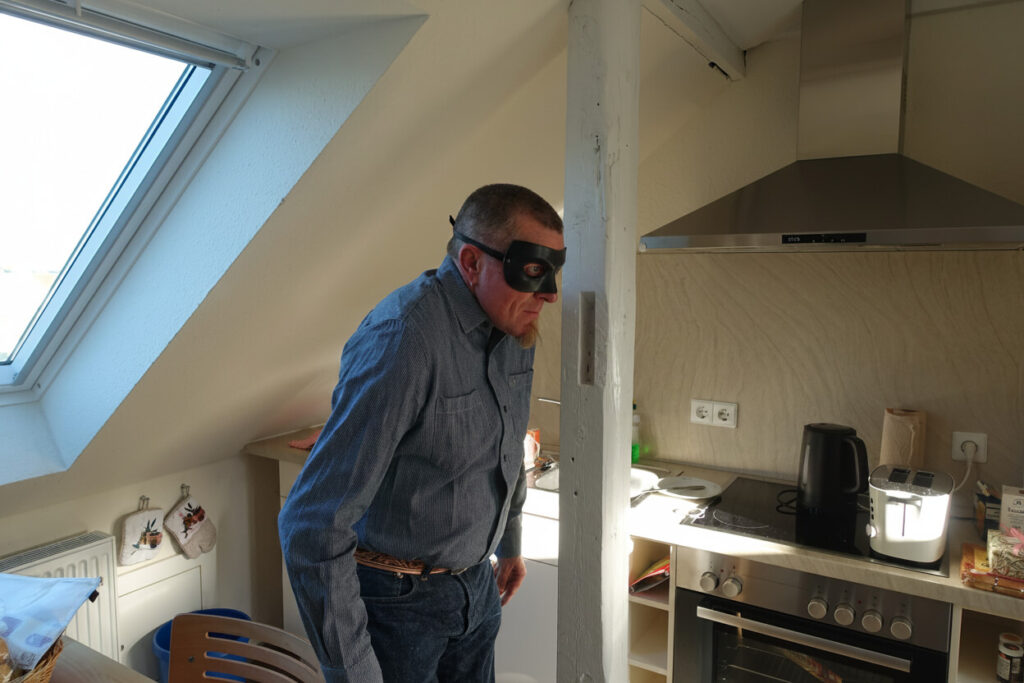
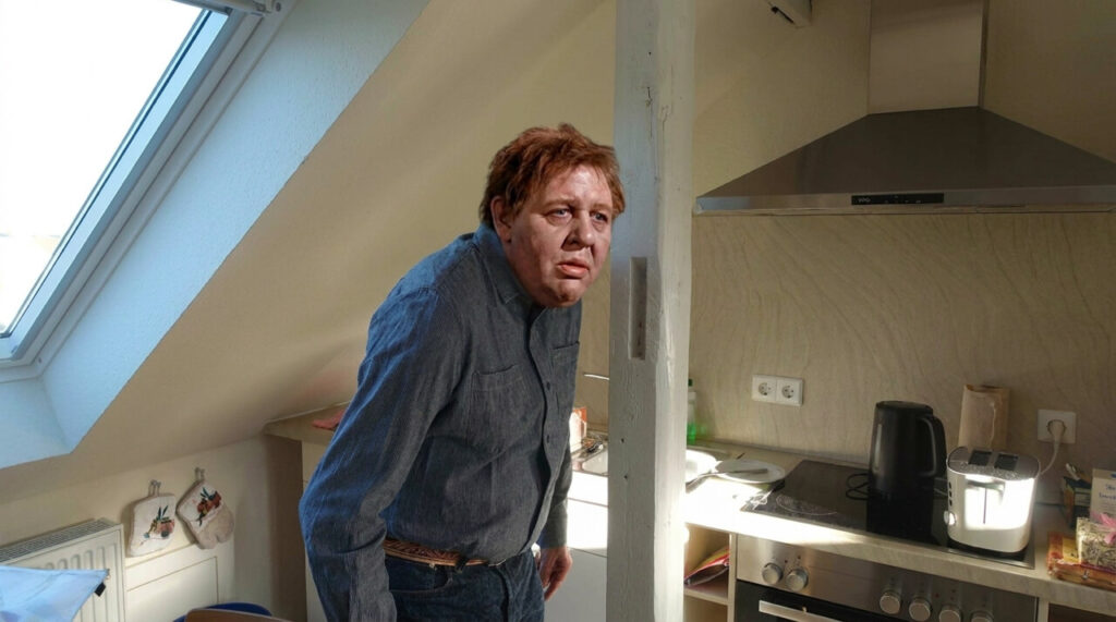
The place made me feel like THE HUNCHBACK OF NORDERNEY:

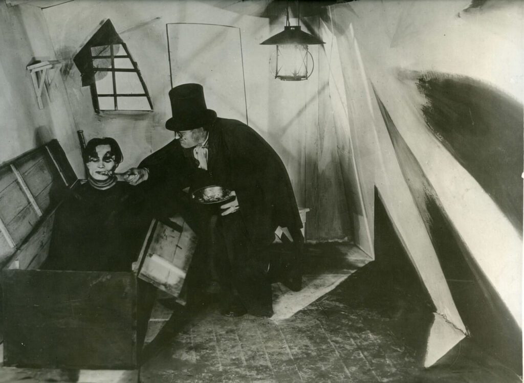
Or perhaps the Somnambule in THE CABINET OF DR. CALIGARI:

Look at this seemingly harmless picket fence. A place of scenic beauty to some, a reminder of the opening scene of BLUE VELVET to others:

Always a good sport, here‘s the Postercowboy doing his best trying to blend in:

For some reason, Norderneyers are not too fond of street numbers, they prefer to give weird and sometimes creepy names to their houses instead:

As if The Prisoner, Dr. Caligari, Blue Velvet and houses with weird names had not been enough, Mrs. Postercowboy pointed out a building that could have served as the perfect location for Alfred Hitchcock‘s THE BIRDS. With the constantly screaming doves providing the soundtrack.

It’s hard to see on the photo, but they even have frigging birds behind the upper left windows!

Also, take a look at the weird thing in front of the house: MAYBE this is just an oddly shaped street lamp. Compare it to an image of the Martian war machines from THE WAR OF THE WORLDS that can be seen HERE and decide for yourself. What makes this even more disturbing is that these things are buried in the sand all over the island…

As if that had not been enough, I learned that very few people dare to let their dogs run free on Norderney, and apparently for good reason, as they tend to end up like this:

Needless to say, the Postercowboy took the first chance he got to flee from this island of horrors and is now more than happy he made it home safe to Berlin.

Continue Reading