WISE BLOOD (1979) and the market value of original Movie Poster Concept Art
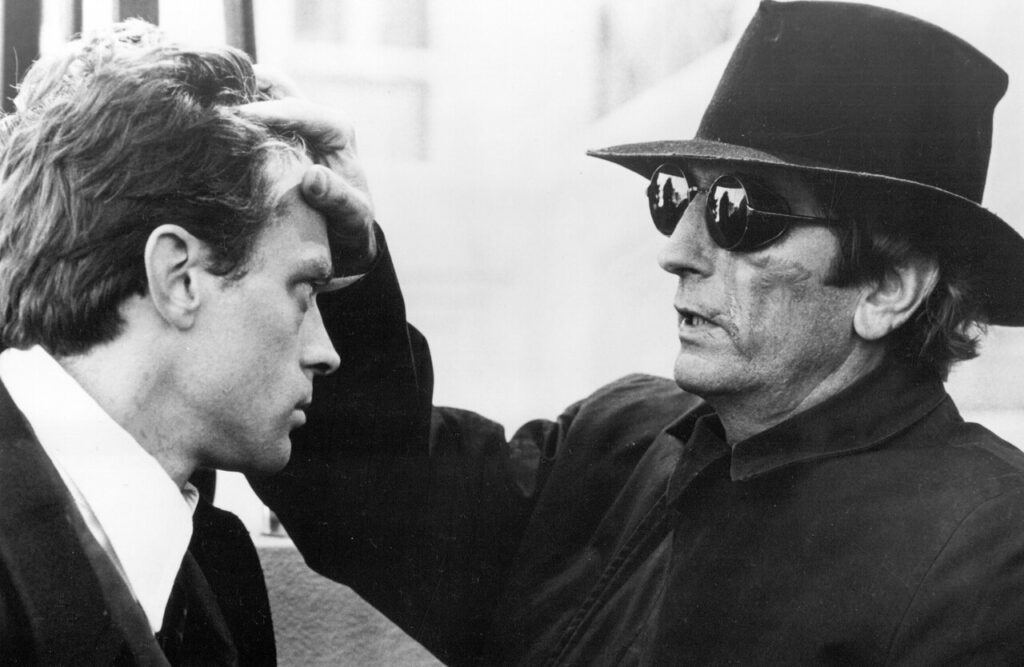
By on April 27, 2026

Another one of my all-time favorite movies is WISE BLOOD, directed by John Huston, released in 1979 and starring Brad Dourif, Dan Shor and Harry Dean Stanton. The film is closely based on the (equally wonderful) Flannery O’Connor novel. Most people would label this a dark comedy, I tend to think of it as a rather close-to-the-facts mockumentary on the American South. Upon its theatrical release, it was a moderate success, and it is still considered a ‘cult favorite’.
A very informative plot outline can be found on WIKIPEDIA. If you haven’t seen it (or want to see it again) the CRITERION DVD is quite amazing.

The film only had a rather limited international release, so very few movie poster designs exist and none of them are overly exciting. (Click HERE for the original release French poster we have for sale. It’s not great, but in my opinion still ‘best of the bunch’.)

The film was a German-American co-production, and it was initially intended for a theatrical release in Germany. In the end, Germany’s ZDF public television bought the rights, so the movie never made to the big screen. In their infinite wisdom, ZDF most likely buried it in one of their late-night screenings.

However, in preparation for an initially planned theatrical release a movie poster was commissioned with German graphic designer Christian Diener. The poster was never printed, but the original concept art has survived. Here it is:

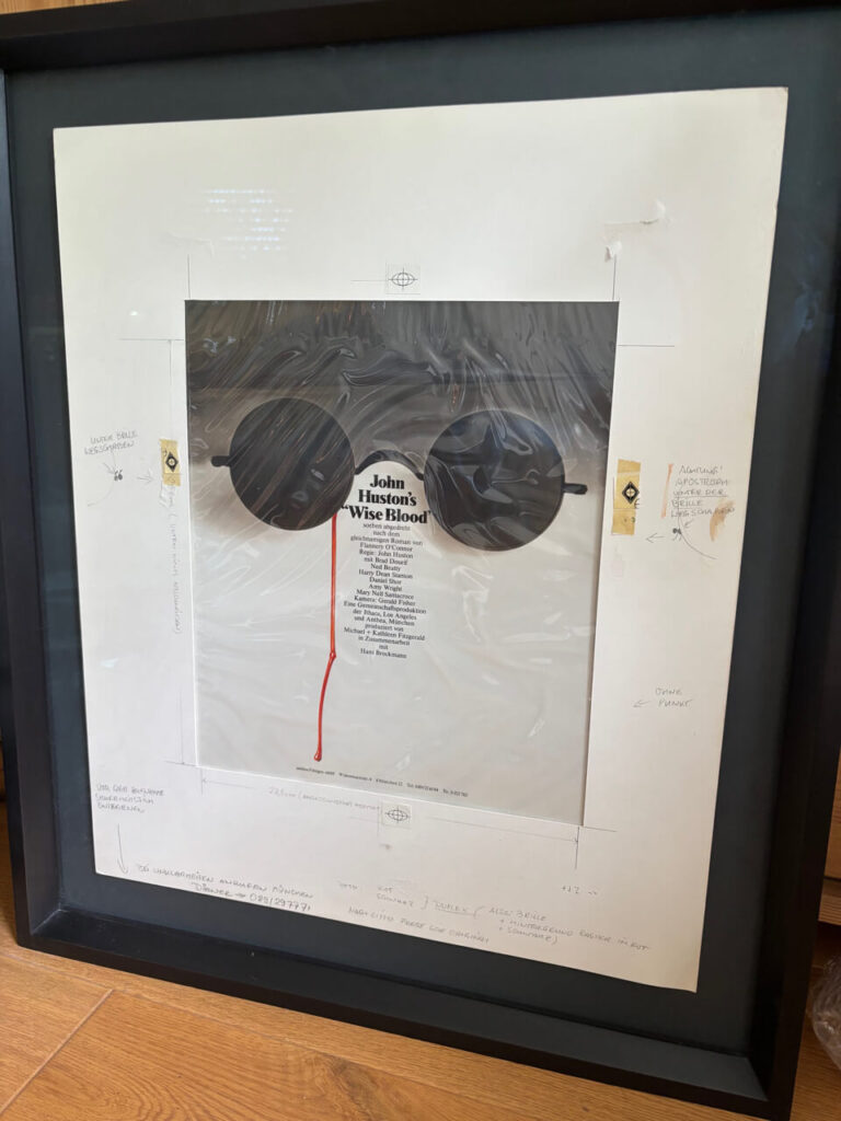
Let’s face it: This is it. Or more exactly ‘this would’ve been it’. I think it’s absolutely amazing and I absolutely love it.

The (obviously) good news is: It has survived. More good news is: Not only do I know the current owner, she’s a very nice person as well. Which is follwed by the (obviously) bad news: She apparently loves the movie at least as much as I do, and she outright REFUSES to sell this one to me! To be honest here, I can’t really blame her.

Speaking as a fan, this piece is absolute gorgeous and it brings me to a rather interesting aspect of collecting original movie graphics I have never fully understood: Collecting movie posters as a somewhat ‘serious’ hobby more or less goes back the 1970s, which is not that much of a history to begin with. In comparison, an ‘active’ collectors market for original concept has only developed about 15 years ago. Two of my personal favorites are the original artwork for the British video poster for KILLER KLOWNS FROM OUTER SPACE (that can be seen HERE) and a Vic Fair design for a British Quad for THE NIGHTPORTER (HERE is an image of that one). Both are now a part of my permanent DARK CARNIVAL shop exhibition and not for sale.

One major difference between these two is: The KILLER KLOWNS artwork actually made it into a poster (the movie was direct-to-video in the UK), while THE NIGHT PORTER concept art was never used. Both designs are ‘best art’ for the movie. In both cases, there is no other existing design that comes even close to it.
For reasons I never fully understood, most concept art collectors exclusively focus on art that eventually made it into a poster. For these two, it means KILLER KLOWNS is worth a small fortune these days. I bought THE NIGHT PORTER in a major US auction a few years ago and I was the only bidder. Amazing as it is, for concept art collectors, it’s still worth next to nothing.

The WISE BLOOD concept art is not for sale, but as a movie poster dealer I can‘t help wonder: How to price a thing like this? The honest answer is: I have no clue.
As a work of original movie poster art it is gorgeous, but since it has not been used, it’s more or less worthless in the current collector’s market. Fortunately, this is a strictly academic question right now.

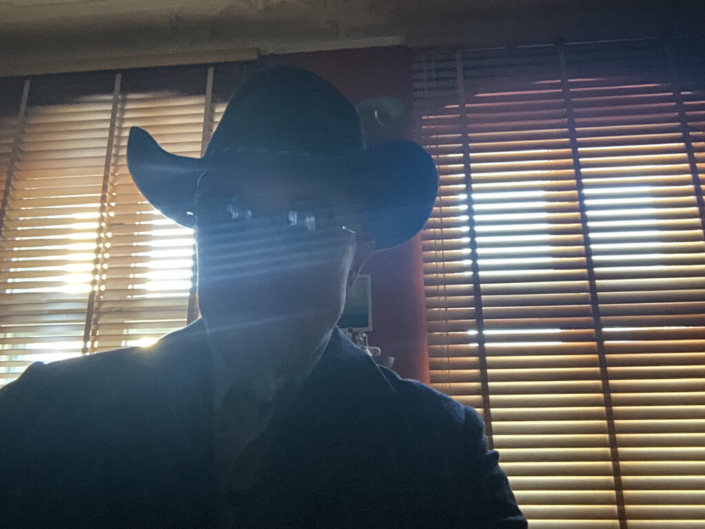
As you may have noticed, this blog is intended to be both educational and also occasionally serves as a public diary of sorts. This post was spawned by a stroll on Berlin’s Kurfüstendamm last week: I was somewhat early for an appointment, so when I passed by at a shop named NOBLE OPTIC HOUSE I had the somewhat unfortunate idea to ring the bell and pay them a visit. This is the kind of place that sells sunglasses that cost more than an average used car. Spoiler alert: Bad idea for my wallet, great idea for my style…

Noble Optic House is a family business, not some faceless company store, and the people who greeted me were both super nice and highly competent. I passed on a €1700 model (which turned out to be their ‘mid-level’ price range), but was clearly too 1980s for my taste. And let’s face it, even I have to draw a line somewhere. They also had me try a very simple but elegant pair of John Lennon type sunglasses, made by GERNOT LINDNER in Germany. Needless to say, I had never heard of him, but Mr. Lindner is apparently quite famous for his sterling silver eyewear which he both develops and manufactures in Passau, Germany. According to his website, Mr. Lindner has a large collection of historic glasses and his own designs are based on those historic models. My kinda guy! What I really like about these glasses is that they look perfectly contemporary, but would’ve also been perfectly in style back in the 1930s.

To cut a long story short, on the way back from my appointment I walked in again and bought them. I still love my Steve McQueen Persol sunglasses (which I discussed in an earlier post that you find HERE) but these are not only extremely lightweight but also totally different. A rather unexpected find, but a very nice and most welcome addition to my wardrobe.

Regardless of their income level, everybody loves a small gift: At NOBLE OPTIC HOUSE they give you a spray bottle of lens cleaner (‘When you have finished this, please come back and we will give you a free refill’) and a tiny box with two small (and very tasty!) chocolates, one with the Maybach logo (the luxury car brand, as they also sell their merchandise) and the other one with their company logo. How nice is that?

Back to the topic at hand: Nothing wrong with John Lennon of course, but what truly sold me on these is that they remind me of Harry Dean Stanton as the (fake) blind Southern preacher in, ta-taa: WISE BLOOD.

I still can’t have the concept art, but now I can now re-enact the movie. What more could you ask for?


Continue Reading

The World‘s smallest Western Boot Company

By on April 20, 2026

The Rockin’ H Boot Company may well be the world’s smallest cowboy boot factory (official production run in 2024 was one pair) BUT we now have an ‘official’ custom made enamel sign. Take that, Lucchese!

This is a traditional, slightly curved enamel sign. In the old days, these metal signs were an advertising staple for big brands and small businesses alike. Until the 1970s, these signs were handpainted, so no two copies were exactly identical. Today, they are silkscreened, but the materials used and the production process has not really changed over the last hundreds years.

This sign was made by Ernst Schmitt in Germany whose company has been in the enamel business for more than 100 years. Needless to say, I am EXTREMELY pleased with the result. Thanks again to owner Markus Schmitt and the nice lady who answers his phone for working with me on this project. It has been a pleasure to do business with you.

Rockin’ H Boots may be a small firm so far, but let’s not forget: Bill Gates also started in a garage…

Continue Reading

To frame or not to frame: Episode 4

By on April 13, 2026

Always a good approach when framing movie poster is to keep it simple. It does not get much simpler than the two frames shown here. First one is an original direct-to-video German A1 poster for Stephen King’s IT, in a very basic black aluminium frame:

KILLER KLOWNS FROM OUTER SPACE was also direct-to-video in Germany, here’s the A1 poster in the same frame, this time in silver:

From what I hear, certain video posters are actually collectible these days and fetch high prices, some of them apparently sell for several hundred Euros. As of this writing, these two are still very affordable, in both cases the frame is considerably more expensive than the poster. I still love them.

What we see here: This is the Nielsen Classic frame. It comes in many colors and many different sizes. Their A1 size frame fits perfectly for almost every modern German 23×33 in movie poster. (Sometime in the 1960s, printers started to cut the posters to the exact standard size, or at least very close to it. Before that, posters were trimmed by hand, so older German movie posters often differ in size by a half inch or more. For many of those posters, a custom framed is required as they are often slightly bigger than A1.

What I like about this frame: Simple yet elegant, high quality, easily available, very affordable.

Continue Reading

To frame or not to frame Episode 3

By on April 6, 2026

Here’s another personal favorite, the French Mini Poster for JAZZ ON A SUMMER’S DAY from 1960, in a retro style Art Nouveau frame:

What we see here: A handmade wood frame with a hand-applied black shellac surface and a hand-tooled real silver inner border and a narrow black matting. This frame was made about 20 years ago, by the exact same artisan standards and technics they would have applied a hundred years ago.

What I like about this frame: What’s NOT to like about this one?

Continue Reading

Great Minds think alike…

By on March 31, 2026

Currrently waiting for master bootmaker Korbinian Ludwig Hess to get the work done on another pair of cowboy boots.

And with spring vastly approaching, it might also be time for some spring cleaning. Of course I haven’t started (and I don’t think I’m anywhere close yet), but the thought alone makes me feel like my old cowboy hero Gene Autry:

Continue Reading

Movie Poster Dealers in the Movies

By on March 30, 2026

Today I want to tell you about a rather elusive and almost forgotten sub-genre of the classic Hollywood western: Films about movie poster dealers.

Perhaps the earliest appearance of a movie poster dealer on the big screen was William S. Hart in THE POSTER MAN from 1917. The poster depicts a key scene in the movie, where the hero has just learned that he has (once again) lost out on aquiring a major collection. And don‘t we all know how that feels.

Buck Jones brought several lighter episodes from the everyday life of a movie poster dealer to the silver screen in the pre-code western RIDIN‘ FOR POSTERS (1932):

In the following year, Tim McCoy taught this fellow posters dealers the meaning of the word ‚respect‘ in POSTER MEN (1933):

And one final example, Gary Cooper won both the big collection and the girl in THE POSTERMAN (1937). Here’s the rare Style B Onesheet:

Continue Reading

A Collection of Movie related Exhibition Posters

By on March 24, 2026

Over the last 50 years or so, the movie poster hobby has developed from a tiny collector’s niche almost exclusively populated by nerds and geeks to a playground for corporations and million dollar sellers, with regular auctions that gross $2 million and more.

Despite my 30 years as movie poster dealer and ten more years as a collector, I’m still a fairly ‘small fish’ in this big business pont. With that in mind, I’m actually surprised that it is still possible for someone like me to ‘break new ground’ so to speak. Which brings to the point of today’s post: The collection of more than 80 cinema related exhibition posters I recently added to the website.

For all I know, this is the first time a large selection cinema exhibition posters like this has been offered for sale. Below are three of my personal favorites from this lot. The rest can be seen in my CATALOG.

#1 BERT STERN MARILYN MONROE

From what I heard, Marilyn Monroe looked through all the photos Bert Stern shot of her and used a marker pen to cross out those she did not want published. The Stern originals sell for big money at auctions and art gallery these days, but the 1993 Hamburg exhibition poster is a rather affordable alternative:

#2 AUDREY HEPBURN BY BOB WILLOUGHBY

Audrey Hepburn wearing a Stetson Open Road cowboy hat. What more can I say?

#3 JOE DALLESANDRO SUPERSTAR

When I started out as an international movie poster dealer, among my bestsellers were the German posters for Andy Warhol films, first of all TRASH and FLESH. I think the German distributor had high expectations for these films, so large quantities of posters were printed. Needless to say, large quantities of posters survived and I would easily find them at film fairs for very little money. Sometime, I even picked them from the dollar bins. That was years before the internet, of course.

Looking back, it seems the Warhol posters alone paid for more than extended vacation in the US…

Another photo from this session was used for the German Style B poster that you can see HERE.

Hard to say why, but I personally like the exhibition poster a lot better:

Continue Reading

To frame or not to frame: Episode 2

By on March 16, 2026

Here’s another perfectly ‘classic’ approach to framing a vintage movie poster, an original release German 23×33 in A1 poster for ROCKY from 1978:

What we see here: A simple yet elegant wood frame with a white spacer and a white backing board. The poster has been fixed to the backing in the corners only, making it ‘float’ in the frame.

What I like about this frame: Movie posters were originally displayed in show cases outside the cinema. This type of frame mimics a cinema display, and in my book it does not get more classic than this.
Also, back in the days, movie posters were sent out folded, and this type of frame also emphasizes on the simply fact that the folds are a characteristic, not a defect. I love it.

Continue Reading

To frame or not to frame, that is the question…

By on March 9, 2026

For the Postercowboy (or any other vintage movie poster dealer), this is a rhetorical question, of course. By design, movie posters are meant to be displayed, and, quite obviously, the best way is to have it properly framed.

Every now and then, clients send me photos of posters they have bought from me in their custom made frames. I absolutely LOVE to see my posters in their new home, so please keep these photos coming!
A few weeks ago, I received two messages, both frames were ‚state of the art‘ in my book, so I asked the senders for their permission to publish them in this blog.

Here‘s the first one: SUNSET BOULEVARD original release German double-panel (1950), app. 33×46 in, folded:

What we see here: An elegant black wood frame, double-matted, with a thin red line in the outer matting and museum style glass.

What I like about this frame: The black border perfectly mirrors the dark mood of this Film Noir masterpiece, while the thin red border line picks up the red color from the film strip. This is clearly a ‚cost no object‘ frame, it perfectly matches the poster and appears to be extremely well made. The final result is absolutely stunning. I love it.

Continue Reading