A Farewell to the Mysterious Rhinestone Cowboy

By on August 31, 2026

Outlaw Country legend David Allan Coe passed on April 29, 2026. I’m not strong on obituaries, but when I learned that DAC had finally left us, I felt I had to say SOMETHING on this blog.

Today’s the last day of August, so you can tell it took me a LONG time to come up with something I feel might be even remotely appropriate.

Let’s face it, DAC was as crazy as they come. After they made him, they broke the mould. I guess I’m not exactly your average Joe, but this guy? There’s nothing I could come up with in this post that could do him remotely justice.

He wrote lots of great originals, but for some reason one song that especially stuck with me is his cover version of Dave Loggins’ PLEASE COME TO BOSTON.
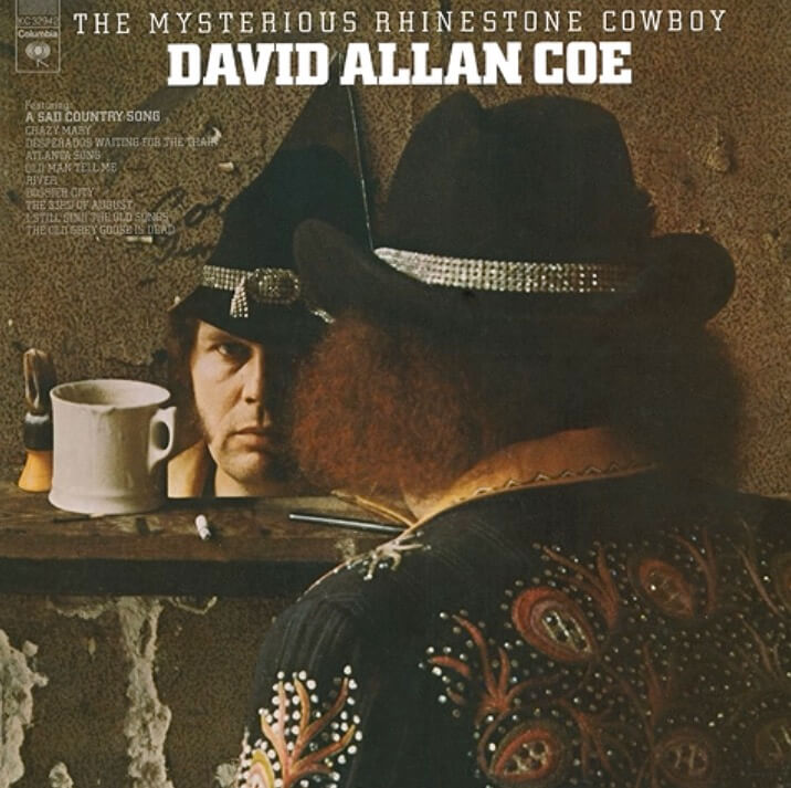
Recorded during the Mysterious Rhinestone Cowboy sessions in 1974, it is included in most newer digital releases but was not on the original vinyl album. It was first released as a B-Side of his Willie, Waylon, and Me 7“ in 1976.
For me, the sentiment, the longing, and the emotion he manages to put into this song are unmatched. His version still puts tears in my eyes every time I play it:
In 1976, he reinvented himself as THE LONGHAIRED REDNECK (a song he co-wrote with Jimmy Rabbitt). The sentiment is still there (this is country music, after all), but this time it feels more like crocodile tears. Needless to say, this one also has a permanent spot in my personal Eternal Top 100 Country Songs.

In his younger years, he was what we might call a ‘sharp dresser’. This photo was taken in the early 1970s, when he was still touring as the ‘Mysterious Rhinestone Cowboy’:
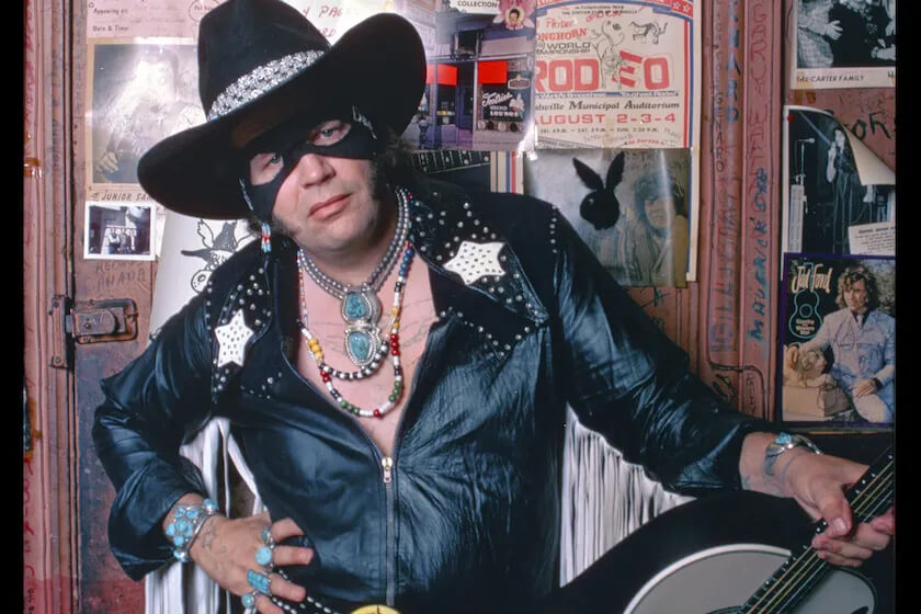
DAC adopted a lot of roles in his life. He had an amazing talent, and while his voice may come as an ‘aquired taste’ to some, once he had grabbed you, he would never let loose again.

I don’t even remember the first time I listened to a DAC recording. Like Johnny Cash, Willie, Waylon, Kris, and so many others, it seems he was always ‘just there’.

Truth be told, great talent that he was, modesty was never his thing. Let’s face it, in the end he was always his worst enemy. Those two X-Rated albums he released independently in 1978 and 1982? Ouch. He was never in good standing with the country music establishment, but, to put it mildly, this stuff certainly did not help.

The X-Rated albums also earned him the ‘racist’ label that stuck for the rest of his life. I don’t know about that. Among other things, the guy had a black drummer in his band. In the 2000s, he frequently distanced himself from this term on stage, asking people to ‘walk in his shoes’.

In the end, I guess he hated pretty much everybody, regardless. He also blamed everybody else for the fact that he never got the full recognition he deserved.

To quote the man himself, ‘AND IF THAT AIN’T COUNTRY, YOU CAN KISS MY ASS.

Farewell, David Allan Coe. There’s a Postercowboy in Berlin who will remember you fondly for the rest of his life.
Continue Reading

NEW PACKAGING REGULATION: NO MORE EU SHIPPING

By on August 21, 2026

With immediate effect, Galerie filmposter.net will no longer be able to ship orders to other EU countries. It is still possible to place your order, but you will need to specify a shipping address in Germany. The only solution I can see at this point is to use a mail forwarding service, like www.forward2me.com.

Since August 12, 2026 the new EU Packaging Regulation is in force. For smaller businesses, this means having to pay a hefty ransom to be allowed to ship goods to other EU countries.

The biggest problem is that the obligations and costs are largely handled on a country-by-country basis.
I’m already paying an annual fee in Germany for the packaging material I distribute. So today I called the company that handles this matter for me and asked what it would cost to ship to other EU countries. For example, if I wanted to ship to Austria from now on, I would have to pay an annual fee of €274 for an ‘authorised representative’ in Austria, plus a minimum of €150 for the packaging itself, a total cost of €424. This would give me the right to ship up to 1,500 kilos of packing material to Austria every year. Average weight of my packing material is about 0.4 kilos per order, so this deal would allow me to ship 3,750 packages to Austria in a single year. For the record, this month I had exactly two orders from Austria.

And that is just one of the 26 other EU member states.

As we all know, if you pay a blackmailer once, you can hold your breath until he comes back for more.

What probably pisses me off most is that the system places a particularly heavy administrative and financial burden on small businesses selling across borders. Large companies with established operations in multiple countries are obviously in a completely different position when it comes to absorbing these costs.

Honest to God, I’m not a conspiracy nut, but once again this has all the stink of Big Business lobbying about it.

And it’s not only small businesses like mine that will lose money. It will also affect consumers in the smaller EU countries. Who in their right mind would pay hundreds of Euros for the right to ship one or two orders to Slovenia, Malta or Lithuania?

For customers in these countries, this effectively undermines one of the great advantages of the European Union: the ability to buy specialised products from small businesses elsewhere in Europe.

No more vintage or antique goods. No more specialty products from small manufacturers. More and more, people will be left buying from the big players simply because small businesses can no longer afford to sell across borders.

The whole issue is due to be reviewed by the EU Commission in October, and there is hope that a de minimis rule or other simplifications for small businesses may eventually be introduced.

For the time being, however, the rules are in effect. Anyone who simply ignores the obligations and continues shipping across the EU risks enforcement action and potentially substantial penalties.

The Postercowboy has never given in to blackmailers in his life and does not have the slightest intention of starting now.

So, with immediate effect, Galerie filmposter.net will no longer ship to other EU countries.

As stated above, it is still possible to place your order on this website, but you need to specify a private delivery address in in Germany. For the time being, this is the only solution I can see to work around this mess.

Orders to the United States, the United Kingdom, and Switzerland will continue as usual.

GOOD NEWS for buyers in the US of A: Under US law, poster prints (TARIC Code 4911.9100) are considered Informational Materials. Even the World‘s Most Wonderful President Ever is not allowed to limit the free distribution of information by trade embargoes or tariffs.
As the current new regulation shows, the EU Commission quite obviously has no such concerns.

If you want to discuss possible solutions to this mess, feel free to drop me a note.

As they say, a picture is worth a thousand words. Here’s the future of many small businesses if this EU regulation stays in effect:

Continue Reading

Movie Poster Spotlight: A Chinese Ghost Story (1987)

By on August 17, 2026

The best movie posters not only decorate a room. They define it.

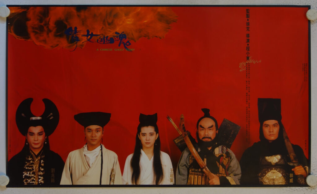
This wonderful Hong Kong poster for Tsui Hark‘s A CHINESE GHOST STORY is a perfect example:

The film is an absolute classic of Hong Kong cinema and spawned two sequels. The poster is one of my all-time favorites among modern Hong Kong cinema posters. Many Hong Kong posters from the time are somewhat overloaded with text and imagery. More often than not, there is just ‚too much going on‘.

This design is a welcome exception: Simple and reduced to an utmost minimum, yet absolutely striking. Rather than telling a story, the poster introduces the characters like a theatre lineup awaiting the opening curtain. The thunderstorm in the top left signals that we are to expect a fantasy film. The writing is also kept at an absolute minimum and becomes a design element in itself. As typical for Hong Kong movie posters, the title is stated both in Chinese and English.
The vivid red background is not just scenery, it is a dedicated color panel and becomes a statement in itself. A statement that is emphasised by the straight black border.

With app. 24×39 inches, it is on the larger side for Hong Kong movie posters. Usually, a movie poster design has to conform to a standard size. Here, it feels like the size was chosen to serve the composition rather than the other way around. The graphic design of this poster focuses on maximum impact, and the size follows the design.

Any poster can fill a frame. A great poster can fill a room.

This poster absolutely demands a simple black frame, a white wall and A LOT of wall space all of its own. I can perfectly envision it in any kind of modern and/or minimalist environment.

The poster is available for purchase and will go up on the website with one of my next updates.

Continue Reading

Movie Poster Spotlight: Dragoon Wells Massacre (1957)

By on August 10, 2026

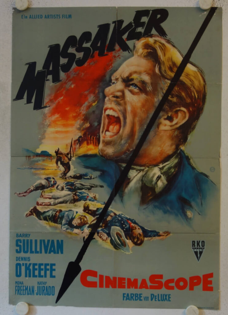
Following up on last week‘s post I want to show another ‘perfect’ movie poster today, the original 1958 release German poster for DRAGOON WELLS MASSACRE:

Graphic designer Will Williams was born as Willi Haseneier in Germany in 1922. After the end of World War II he changed his name to Will Williams and migrated to Rome for a few years. He supposedly met directors like Roberto Rosselini and Federico Fellini who introduced him to the great Italian poster artists. His own work is strongly influenced by these Italian masters.
Especially his faces often show a gritty, life-like realism that is hard to match.

The movie itself is basically a run-of-the-mill B-western and tells the story of a wagon train of prisoners that is attacked by Indians. The US campaign was perfectly dull and the posters are generally considered non-collectible.

As outlined in last week‘s post, the sole purpose of a movie poster was to lure the viewer into the movie house. Shortening the title to MASSAKER (which does not need translation) was another smart move by the distributors. In the top right hand we see Dennis O‘Keefe in a US Army uniform, crying out in anguish. The left hand of the poster shows a band of dead soldiers and a dying cowboy. The image is cut up by a stylised Indian arrow and completed by a fire in the background. The necessary credits are shown on a grey background.

There‘s a lot of grey background, which allows the viewer to focus on the three key elements of the poster. Add the striking title and it only takes a single glance to know what we can expect here: An action-packed Indian western with lots of dead white men.

An ordinary western. An extraordinary poster.

The poster is available for purchase and will be added to the website with my next update.

Continue Reading

Movie Poster Spotlight: OUTSIDE THE LAW (1956)

By on August 3, 2026

Director Jack Arnold is of course best remembered for this horror and scifi efforts like CREATURE FROM THE BLACK LAGOON or TARANTULA. At the time, the studio system was still comfortably established. More often than not, studio directors were assigned projects by the studio executives.

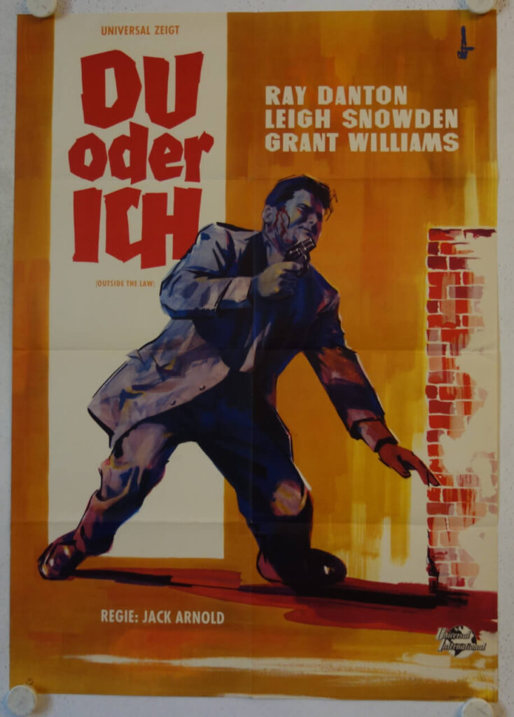
There is no way to tell if he actively opted for this one or if it was simply given to him, but in 1956 Jack Arnold directed a little known Film Noir flic titled OUTSIDE THE LAW, which opened in Germany in September 1959 with this poster designed by artist Hans Braun:

These days, posters are not much more than an advertising gadget. Back in the 1950s (and long after) the movie poster was THE main advertising tool. Its sole purpose was to lure potential clients into the cinema.

Unlike many other posters from the period that are often overcrowded with details, this one does a perfect job. Let’s start with the German title DU ODER ICH (You or Me). Three words, four syllables, nine letters is all it takes to give us a first impression what we can expect here: Some gritty action, and perhaps a story of revenge. Which is both true.

This first impression is emphasized by a stumbling guy with a gun in his hand and blood running from his temple. His suit and the stylized brick wall on the right tell us that this is a crime movie, not a western. And the combination of the red title and brown background suggests that we are in for a ‘bloody affair’. Everything about the design promises hard-boiled urban crime. No romance, no comic relief, just a wounded man with a gun and a desperate situation. Doing what a man has to do.
Unless you’re Travis Bickle, this is not a movie you would take your prospective girlfriend to see.

Whether the film ultimately delivers on its promise doesn‘t matter. By then the poster has done the one job it was created for: getting the audience to part with their money.

I have a US Pressbook for Russ Meyer’s MUDHONEY that can be seen HERE. On the posters page it states ‘DRAMATIC ONE SHEETS – STOP THE EYE… OPEN THE WALLET!’

I always loved that quote, and if the purpose of a movie poster is indeed to stop the eye and open the wallet, Hans Braun succeeded brilliantly.

The poster is available for purchase and will be added to the website with my next update.

Continue Reading