- You do not have any products in your shopping cart yet.
As stated before, the main purpose of a movie poster always was to lure the viewer into the cinema. In the last few weeks, I have shown you a few perfectly ‘successful’ examples.
Today, I want to discuss the German poster for VILLAGE OF DAMNED. The movie opened in Germany on February 3, 1961:
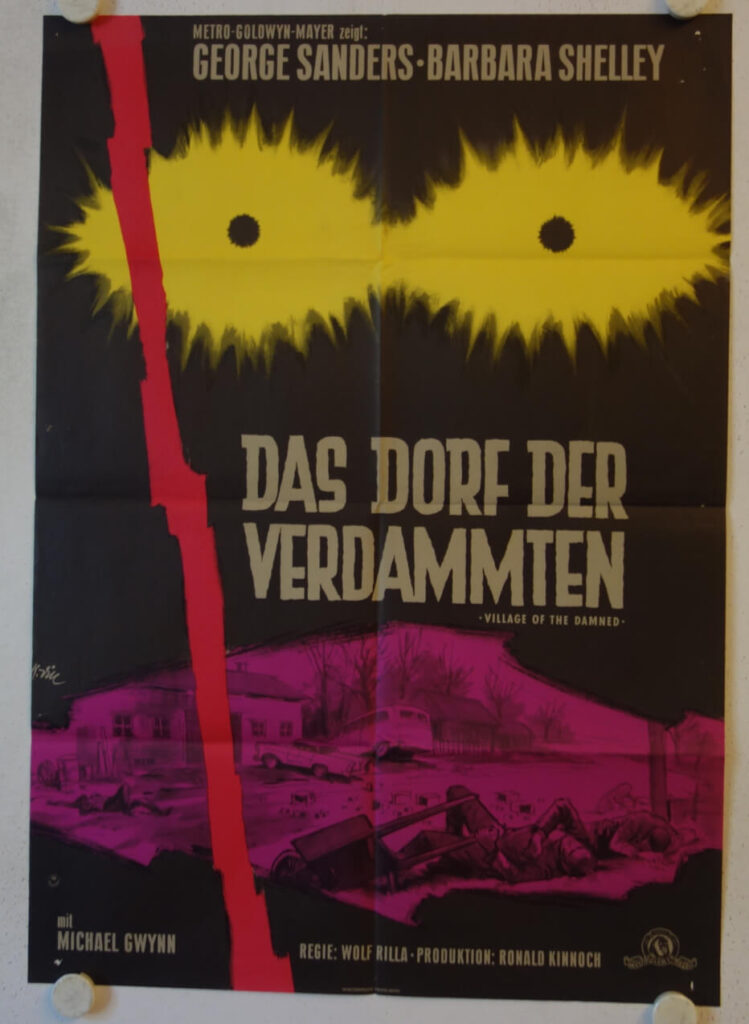
Based on John Wyndham’s novel ‘The Midwich Cuckoos’, the film is a low-budget British supernatural horror movie and tells the story of a band of blond children with glowing eyes that take over an English village. The film is a personal favorite and rightfully considered a classic today.
Released in the UK in 1960, VILLAGE OF THE DAMNED arrived at a time when science fiction was increasingly moving away from simple alien invasions and towards stories about social fears, conformity, and the unknown. The film’s children became one of the most memorable images of British science fiction cinema.
The best movie posters reflect the atmosphere of a film in a single image. As a work of graphic art and as a collectible piece of cinema memorabilia, Klaus Dill’s design is a glowing success.
Unfortunately, the original purpose of a movie poster is to sell tickets. Under this aspect, the design must be considered a failure.
Klaus Dill was an outstanding and highly talented graphic designer, with a strong feeling for creating atmosphere. Unfortunately, sometimes atmosphere is not enough. The title is a literal translation, but the image gives us almost no clue what kind of ‘village’ we are taken to. Is this a war drama? A sinister Heimatfilm? A tale of nature taking revenge? Only The Shadow knows…
Everybody loves a mystery, but when looking at this poster the mystery is not ‘What will happen in this village?’ The mystery is ‘Why should I buy a ticket?’
I once spoke to an elderly projectionist who was around when the movie first opened in 1961. He told me that it was only shown in a single cinema in Berlin and vanished again after only one week. So apparently not too many people found an answer to the question above…
Let’s take a look at the British Quad for comparison:
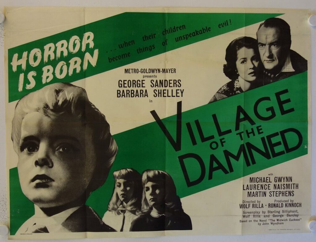
This one has it all: A simple, yet striking design. Concerned parents eyeing the weird kids. And a tagline that reads ‘HORROR IS BORN when their children become things of unspeakable evil!’
This poster makes a clear promise and leaves absolutely no doubt about what we’re going to expect.
The German poster makes us wonder what happened in the village. The British Quad makes us afraid enough to find out.